

Work · Food & beverage
ScHott Sauce
Three sauces that finally read as three, in a typeface drawn for the brand.
- Client
- ScHott Sauce, Charlotte
- Services
- Website · Brand type · Shopify
- Status
- Live since October 2026
- Visit
- schottsauce.com
01
Where they started
A chef with a following and three sauces people already loved, each with its own flavor and heat, a label with real character, and a Shopify store that already worked.
The site’s job was to let each sauce stand on its own, and let the chef behind them show.
02
What I pulled from it
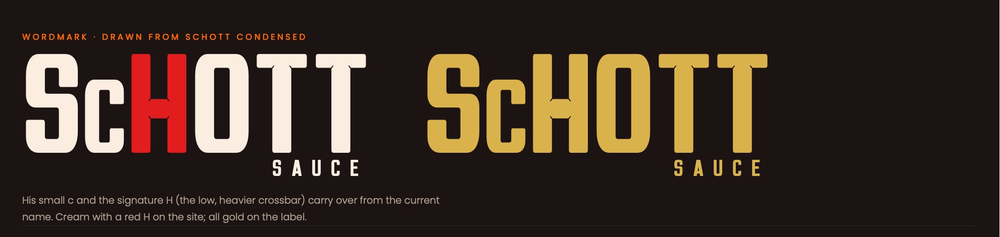
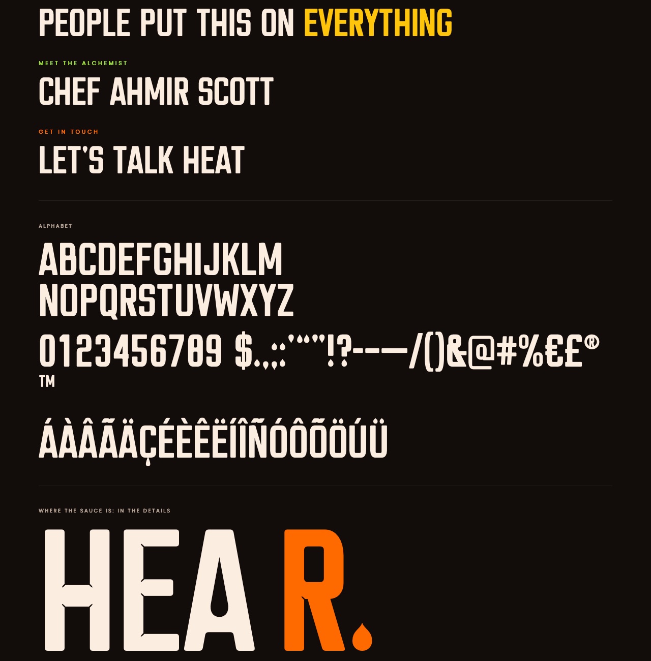
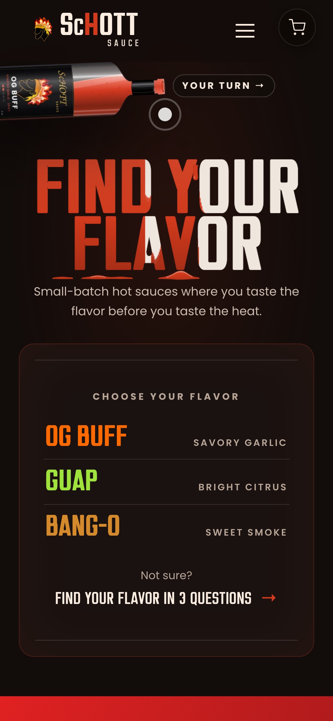
The heat, and the H. The heavy crossbar of the H in ScHott and the drop of sauce became the rules for a typeface: a teardrop inside the A, drop-shaped joins, full stops cut as drops.
His small c and the H carried straight into the wordmark.
03
The signature
ScHott Condensed: a headline typeface drawn for the brand and owned by it outright, for the site, the shelf and the next label.
Figures line up like the heat meter, so prices and heat ratings sit in clean columns.
04
The finished site
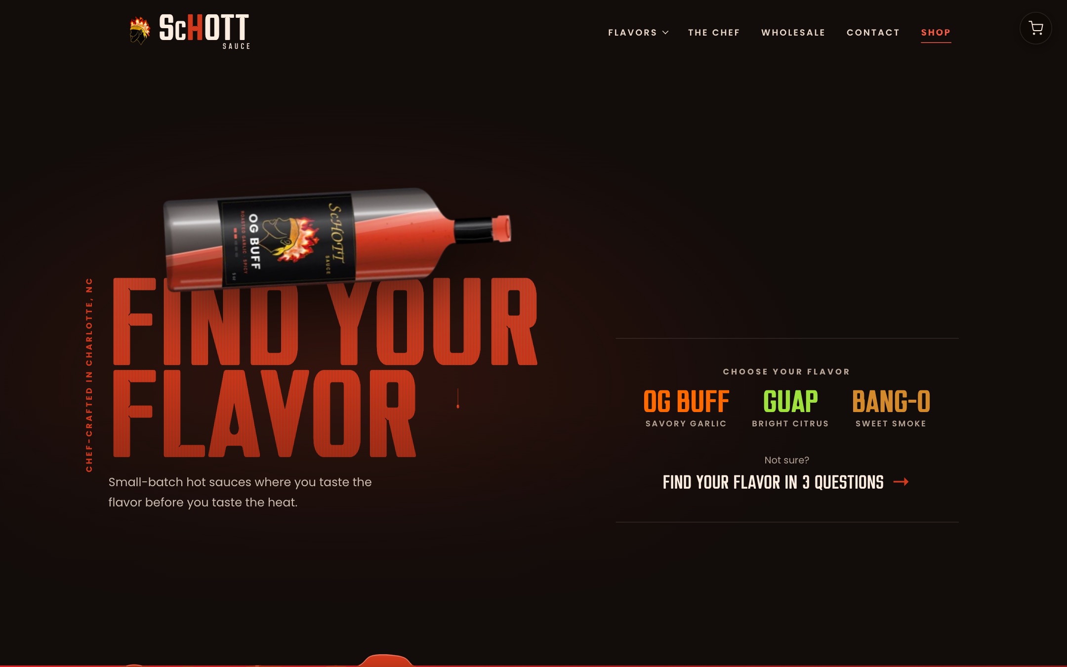
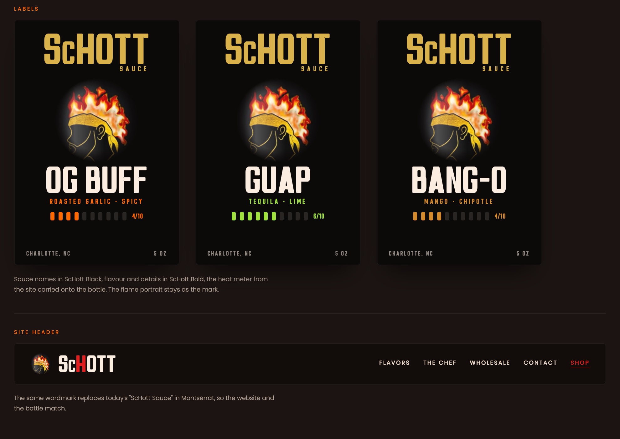
Each sauce leads with its flavor and heat, the bottle tips to pour, and three questions find the right one. Checkout still runs on the Shopify he already knew.
What I decided, and why
- Make the bottle the headline.Each sauce leads with its flavor and a heat rating, so customers can tell them apart before they read anything else.
- Keep Shopify for checkout.Payments, tax and shipping already worked, and he already knew how to manage orders there. I rebuilt what customers see and left the part that was working alone.
- Make the pour work on phones.The animation first followed the mouse, which phones don’t have, so it became drag-to-pour.
Where it stands. Live at schottsauce.com. Each sauce stands on its own, orders still run through the Shopify dashboard he already knew, and he can see which sauces people look at.